
Before a customer reads your ingredients, before they check your price, before they read a single review — they look at your label. In less than three seconds, that label tells them whether your product is worth picking up, trusting, and buying.
This is not a marketing theory. It's behavioral science. Visual cues — color, typography, finish, consistency — trigger instant trust signals or instant dismissal. A product with a generic, misaligned, or cheap-looking label loses business to a less effective product with better packaging every single day.
Custom labels are one of the highest-leverage branding investments available to any product business. Here's how they build trust, why it works, and exactly what to do.
Jokeystickers fact: We work with brands from early-stage DTC startups to established manufacturers — and the most common pivot we see is a brand upgrading their labels after realizing generic packaging was suppressing sales their product deserved. The label was the bottleneck, not the product.
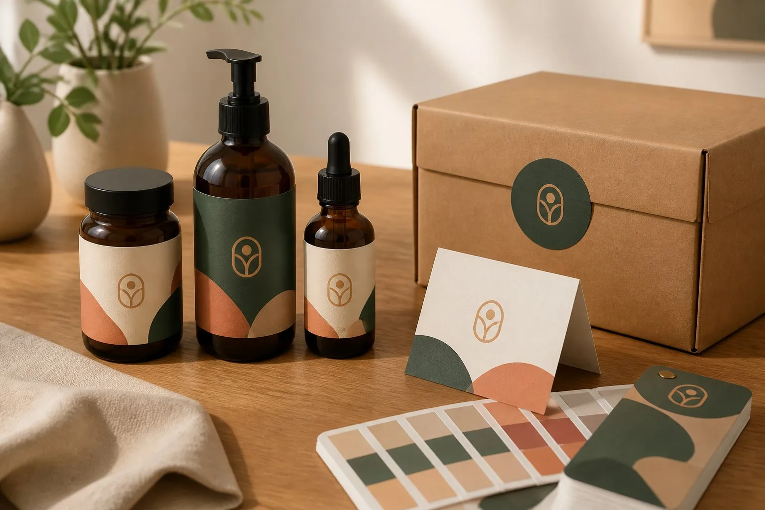
Why do labels build trust so fast? Because trust is mostly visual, and visual processing is mostly unconscious.
When something looks professional, our brain extends that assumption to the product itself: this looks like a quality brand, therefore this is probably a quality product. The reverse is equally powerful: a cheap-looking label makes people skeptical of the product inside, regardless of its actual quality.
When your label design is consistent across your product line — same fonts, same color palette, same layout logic — it signals that you're a real, established brand, not a one-person operation making it up as you go. Consistency is a proxy for reliability.
Matte lamination says "premium, considered, sustainable." Glossy says "vibrant, fresh, energetic." Kraft paper says "natural, artisan, honest." Foil stamping says "luxury, gift-worthy." These are learned cultural codes — your customers read them automatically. The wrong finish sends the wrong signal, regardless of what your copy says.
Ingredient lists, weight/volume disclosures, certification marks, barcode — these aren't just legal requirements. They're trust signals. A label that looks regulated looks safe. A label missing standard information looks suspicious.
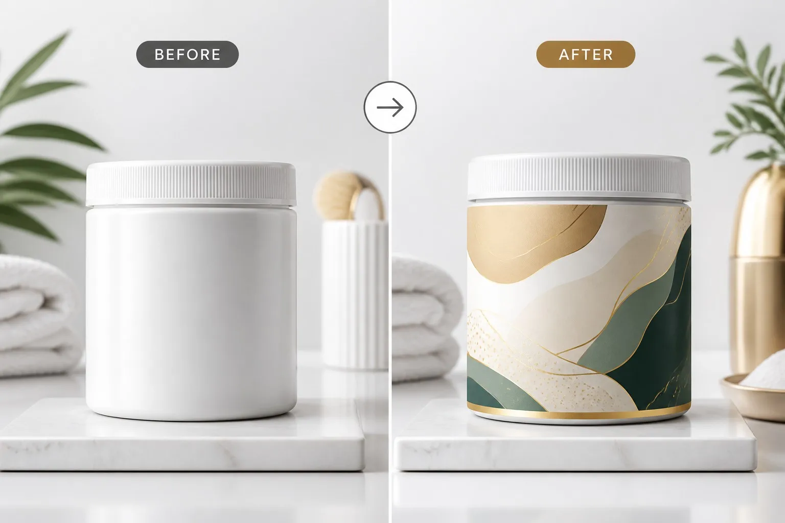
Ready to upgrade your label? Tell us your product and current label situation — we'll recommend the right material, finish, and format to build the trust your product deserves. Get a label consultation →
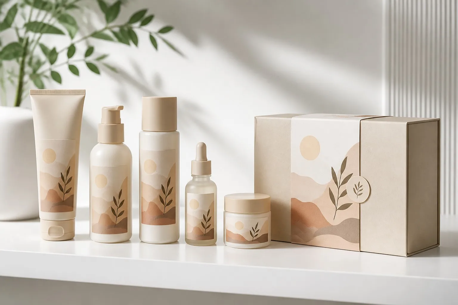
A single great label is a good start. A cohesive label system across your entire product line is a brand. When every SKU shares the same design logic — same typography, same color palette, same finish, same label placement — customers recognize your brand at a glance across any shelf or any category.
This is what separates brands like Aesop, Frank Body, or Oatly from the white-label crowd: every product looks like it belongs to the same family. Achieving it doesn't require a big budget — it requires clear brand standards applied consistently to your custom labels.
The finish on your label is the tactile version of a first impression. Matte lamination says "considered." Glossy says "vibrant and fresh." Soft-touch says "luxury." A label printed on thin paper with no lamination says "I wasn't sure this was worth the investment."
The price difference between a budget finish and a premium finish is often $0.02–$0.05 per label. The perception difference is enormous. Match the finish to your brand positioning — don't default to cheapest available.
Kraft paper on organic skincare signals "natural, honest, minimal." Clear BOPP on a premium beverage says "nothing to hide." Foil-stamped labels on holiday products say "gift-worthy." These aren't arbitrary — they're category codes your customers have learned from the brands they already trust.
Using the wrong material for your category is a subtle trust signal in the wrong direction. A natural skincare brand on glossy bright-white plastic labels creates cognitive dissonance. More on matching material to brand →
This one is often overlooked: a complete, professional label that includes all required information (ingredients, net weight, manufacturer details, compliance marks) looks like a brand that takes its products seriously. A label that skips required fields looks careless — or like it has something to hide.
For food, cosmetics, and supplements especially, compliance is both a legal requirement and a trust amplifier. Our ISO, FSC, REACH, and UL certifications exist because the brands we serve need compliant production — and their customers notice.
A seal label on a jar, bottle, or pouch does something small but psychologically significant: it tells the customer "this has not been opened before you." Tamper-evidence is a trust signal in the most literal sense — it communicates that the brand cares about product integrity, which extends the trust assumption to the product itself.
Most trust problems aren't deliberate — they're the result of small decisions made under cost pressure or time pressure. Here are the patterns that damage brands most.
Different fonts, different color shades, different logo placements across products in the same line. It looks like separate products from separate companies rather than a unified brand.
Blurry text, soft edges, muddy colors — these are immediate quality disqualifiers. They're also preventable: supply print-ready files at 300 DPI and always review a physical proof before committing to volume. Design mistakes to avoid →
Paper labels on products that face moisture. Stiff labels on curved bottles that bubble and peel. The material choice needs to match the application — not just the look.
Color looks different on screen vs print. Always request a physical proof before mass production — especially for food, cosmetics, or any regulated category where label accuracy matters.
Start with a free sample. See your label material and finish in person before committing to volume — no surprises, no costly reprints. Request free samples →
Answer these five questions honestly:
If any answer is no, your label is likely underperforming your product — and a label upgrade will pay for itself in conversion and brand perception faster than most other marketing investments.
Research consistently shows that packaging is a primary purchase driver — especially in categories like food, beverage, cosmetics, and supplements. A label upgrade that improves perceived quality often increases conversion without changing the product at all.
Consistency (same design system across products), finish (premium finish signals premium quality), and completeness (all required information present and legible). Logo prominence matters less than overall professional cohesion.
Matte is generally associated with premium, minimalist, and sustainable brands. Glossy with vibrant, energetic, or mass-market products. Soft-touch matte is the luxury option. Match to your brand positioning, not just your personal preference.
Define brand standards before ordering: exact color codes (CMYK or Pantone), a fixed font set, logo placement rules, and finish choice. Apply them identically to every label in your line. Design tips for brand consistency →
Yes — materially. Kraft paper signals natural and artisan. Clear BOPP signals transparency and premium. Foil signals luxury. Using the wrong material for your category creates cognitive dissonance that undermines trust even when the design is good.
A seal label is a small sticker applied over the closure of a jar, bottle, or pouch — it provides visible tamper evidence. Customers see a sealed product as safer and more trustworthy. See seal label options →
Standard lead time for custom labels is 7–14 business days after proof approval, depending on quantity and finish. Rush options are available. Ask about your timeline →
Yes. We print free physical samples of your chosen material and finish so you can evaluate color, texture, and adhesive performance before committing to volume. Request free samples →
You can have the best product in your category. If the label doesn't communicate that, you'll lose customers to brands with inferior products and better packaging. The good news: a label upgrade is one of the fastest, most cost-effective brand improvements available.
Jokeystickers has manufactured custom labels for 24 years, working with brands from DTC startups to established manufacturers. We're a factory, not a middleman: factory-direct pricing, free samples before production, eight international certifications, and direct communication with the team that prints your labels.
Free samples · Factory-direct pricing · 24-hour quote
Tell us your product and brand positioning — we'll spec the right label.
Request Your Free Quote →Label options for brand-builders:


