
Your design looks perfect on your monitor — vibrant, crisp, exactly right. Then the stickers arrive and the colors are dull, the text is soft, and there's a thin white sliver around the edge you never asked for.
This isn't a printing failure. It's a file-preparation failure. Screens and printers speak different languages, and if your file isn't set up correctly, the printer can only do so much to rescue it.
The good news: after 24 years of printing custom stickers on our own factory floor, we can tell you the exact rules that prevent 90% of the reprints we see. Follow these ten rules and your stickers will look like they jumped off your screen — in the best way.
Jokeystickers fact: We check every artwork file free before production. If something's off, we flag it before you pay for a reprint. But knowing the rules yourself means fewer rounds of back-and-forth — and a faster order.
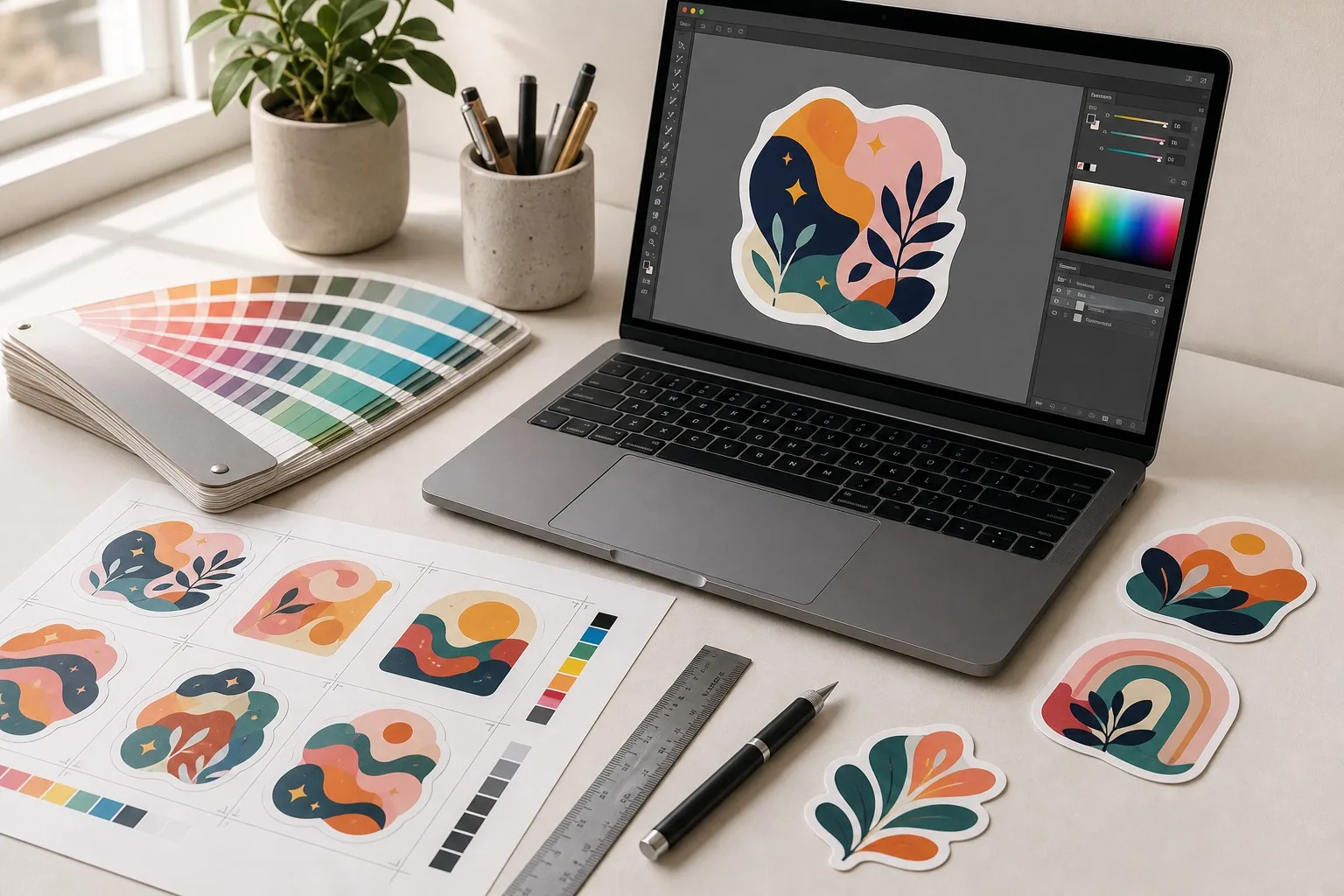
Your screen displays colors using light — RGB (red, green, blue). Printers use ink — CMYK (cyan, magenta, yellow, black). These two systems can't reproduce every color identically.
The practical problem: bright neon greens, electric blues, and vivid oranges designed in RGB will look muted or muddy when converted to CMYK ink. The shift can be dramatic.
What to do: Set your document to CMYK color mode before you start designing — in Adobe Illustrator (File → Document Color Mode → CMYK), Photoshop, or Canva Pro. If a specific brand color is non-negotiable, ask your printer about a Pantone match (costs a little more, guarantees accuracy).
Related: Our complete artwork guidelines →
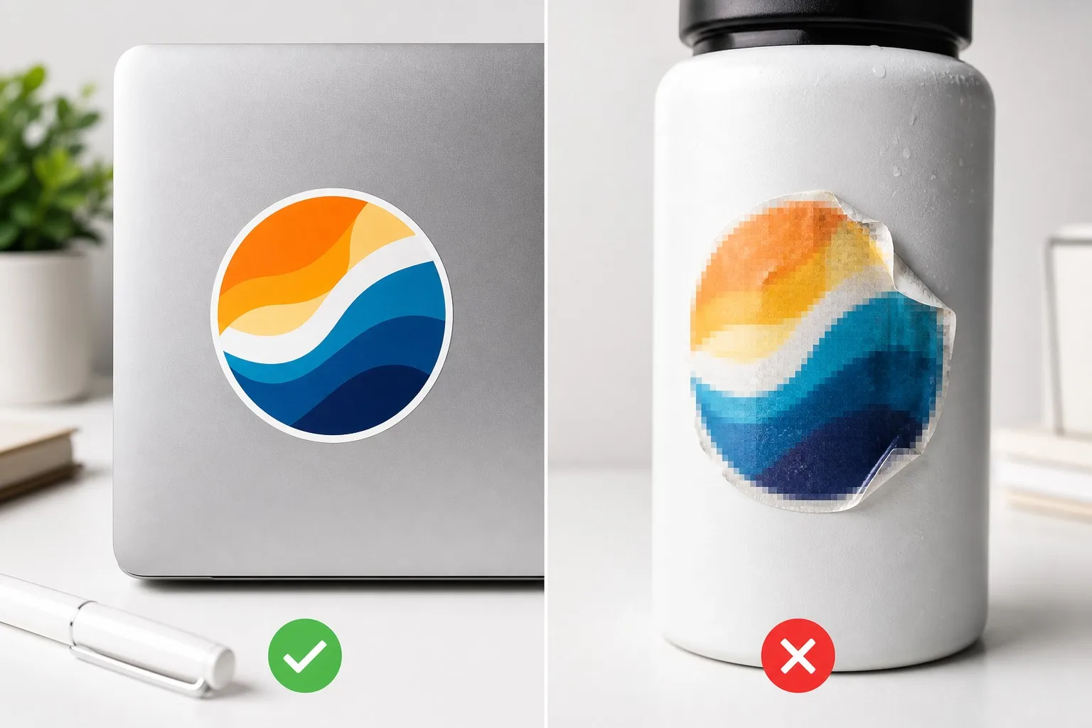
Sticker printing requires 300 DPI (dots per inch) at actual print size. Below that, text and fine lines get soft or pixelated.
Quick check: take your image's pixel dimensions and divide by 300. That's the maximum print size in inches. A 3000×3000 pixel design prints up to 10×10 inches. A 1000×1000 pixel design — common for web graphics — only prints cleanly up to about 3.3×3.3 inches.
What to do: Design at the actual sticker size (or larger) at 300 DPI. Never scale a web screenshot up and call it a sticker file.
Cutting machines are precise, but not perfect. If your design's background stops exactly at the cut line, any tiny variation in cutting leaves a white sliver at the edge.
What to do: Extend your background color or image 1/8 inch (3mm) beyond the cut line on all sides. This "bleed" ensures the cut always lands inside your background, so edges come out clean.
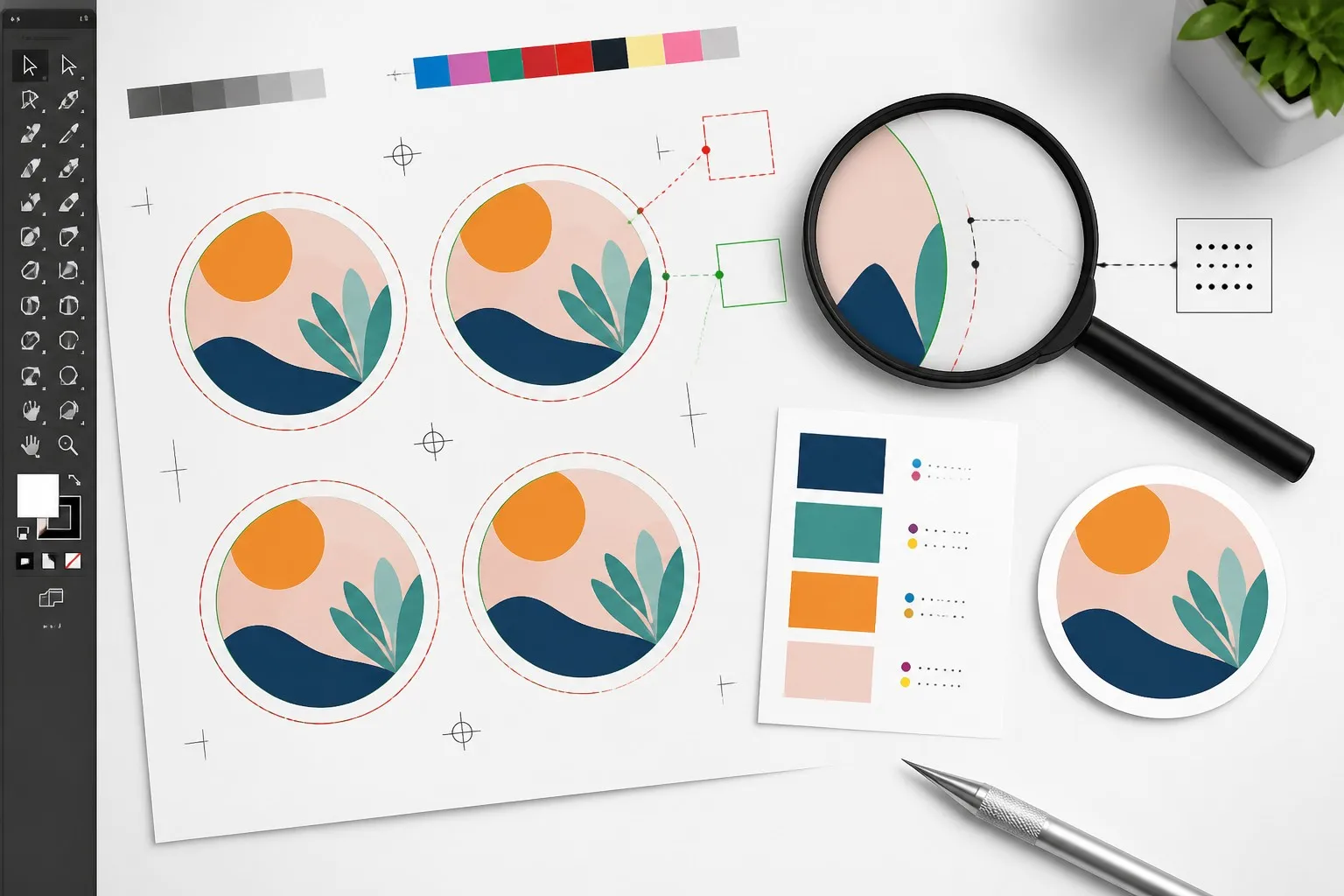
The safe zone is the flip side of bleed: keep all important elements — text, logos, key graphics — at least 1/8 inch inside the cut line.
Why it matters: elements sitting too close to the edge risk being partially trimmed by the cut. A logo that loses its corner is a reprint.
Rule of thumb: background bleeds out 1/8"; content stays in 1/8". Easy to remember, and it saves most edge-related disasters.
Vector files (AI, EPS, PDF) describe shapes mathematically — they scale to any size with zero quality loss. Raster files (PNG, JPG) are fixed grids of pixels that degrade when enlarged.
What to do: If your design has text, logos, or sharp shapes, send a vector file. High-resolution PNGs (300+ DPI, transparent background) work well too — especially for full-color artwork with gradients. Avoid JPEG entirely for anything with text or crisp edges; compression artifacts will show in print.
Not sure if your file is print-ready? Upload it when you request a quote — our pre-press team checks artwork free and will flag any issues before production.
What looks crisp on a 27-inch monitor becomes illegible at 2-inch sticker size. Text and lines don't scale down gracefully.
Minimums that work in practice:
Pro tip: print a test at actual size on your home printer and stick it where the sticker will go. If you can read it from arm's length, it's probably fine.
Your sticker file might reference a font the printer doesn't have installed. When that happens, the text gets substituted with a different font — and the layout shifts.
What to do: In Illustrator, select all text → Type → Create Outlines. This turns your type into vector shapes that print exactly as designed, on any system. Always keep a copy of the editable original — outlines can't be edited later.
Every screen renders color differently. The "true red" on your monitor isn't the same on your colleague's laptop, your phone, or the printer's proof system.
What to do: For brand-critical colors, ask for a physical sample printed on your material before the full run. Our free sample service exists exactly for this — you confirm the color on real vinyl or paper before committing.
Also remember: the digital proof you approve shows approximate colors. Physical samples are the only way to be certain.
Die cut and kiss cut stickers have different design constraints:
Every reputable printer sends a digital proof before production. This is your last chance to catch mistakes at zero cost.
Check on a large screen, not your phone:
Changes after proof approval usually cost extra. Read it like your brand depends on it — because it does.
Before you hit send on your artwork file, run this checklist:
Related: Common Die Cut Design Mistakes (And How to Avoid Them)
Design ready? Send your file for a free pre-press check — we'll confirm it's print-ready and quote factory-direct pricing within 24 hours. Get your quote →
Vector files (AI, EPS, PDF) are preferred — they scale without quality loss. High-resolution PNGs (300+ DPI at actual size, transparent background) work well too. Avoid JPEGs for anything with text or sharp edges.
Screens display in RGB (light), printers use CMYK (ink) — the two systems can't match every color. Design in CMYK from the start, and request a physical sample to verify brand-critical colors.
Bleed is extra background extending past the cut line (1/8 inch is standard). It prevents white slivers at the edge caused by tiny variations in cutting. Without bleed, even precise cuts can show a hairline of backing color.
300 DPI minimum at actual print size. Divide your pixel dimensions by 300 to find your maximum clean print size. Vector files bypass this entirely — they're resolution-independent.
Yes — a high-resolution PNG (300+ DPI) with a transparent background works great, especially for full-color artwork with gradients. Just make sure it's not a low-res web export.
Yes, if you're sending a vector file. Converting text to outlines guarantees your fonts print exactly as designed, even if the printer doesn't have them installed. Keep an editable backup for future changes.
6pt for bold sans-serif fonts, 8pt for regular or serif fonts, at the sticker's actual size. White-on-dark (reversed) text should be slightly bolder. When in doubt, print a test at actual size and read it from arm's length.
Yes — we check every artwork file free before production and flag any issues before you approve. This is standard at our factory, not a paid extra. Send us your file and we'll confirm it's ready.
Send us a rough sketch or concept — we can help refine it into print-ready artwork. A small design fee may apply, quoted upfront before any work begins. Talk to our team →
The ten rules above sound technical, but they're really about one thing: making sure the sticker in your hand matches the design in your head. A few minutes of file prep saves weeks of reprints and disappointment.
Jokeystickers has printed custom stickers for 24 years. We're a factory, not a middleman — factory-direct pricing, free samples before production, and free artwork checks on every order. We hold eight international certifications (ISO, FSC, UL, REACH, and more).
Free pre-press check · Factory-direct pricing · 24-hour turnaround
We'll confirm your file is print-ready and quote your order.
Request Your Free Quote →Ready to create your stickers:


